Petit Duc
B2B SaaS · Marketing Website Redesign
Shipped
Petit Duc’s product worked. Its website didn’t sell it. I helped fix that.


Quick facts
Company
Petit Duc
an event-sustainability SaaS platform
My role
UX research · product strategy · UI design · prototyping · client relationship lead
Team
3-person design team
in partnership with Merisia
Timeframe
5 weeks
Status
Shipped
The problem
A great product, hidden behind a website that couldn’t say so.
Business problem
Petit Duc had proof its product worked: successful pilots and real customer results. But the website didn’t reflect that.
As the company prepared to move upmarket from early regional customers to larger organizations, qualified buyers were leaving before they understood what they were looking at.
User problem
Event planners evaluating the platform couldn’t tell what it actually did, couldn’t find evidence it worked, and had no clear or single path toward booking a demo.
Constraints
5-week timeline for a full site strategy and redesign
Client was attached to the existing brand-story-first homepage
Small usability testing sample, so findings needed to be directional, not conclusive (and I had to be honest about that with the client)
How I got there
Understanding how event planners actually evaluate software like this.
01
Heuristic evaluation
02
Competitive analysis
03
Expert interviews & surveys
04
Personas & IA exploration
What I expected to hear: sustainability expertise would be the deciding factor.
What I actually heard: it wasn’t.
“I need to see what they’re selling. You eat with your eyes first.”
Planners weren’t shopping for a sustainability expert. They were shopping for confidence: proof this would be easy, credible, and defensible to their own stakeholders.
That single finding changed the direction of the project, from “redesign the website” to “design out the uncertainty stalling the buyer journey." It’s what I brought back to the client to justify a bigger structural change than they’d originally scoped.
The decisions
Three calls, each with a real trade-off attached.
The client initially preferred leading with their brand story. Our research suggested visitors first needed to understand what the product actually did. Presenting interview findings during a review meeting helped us align on moving the product interface into the hero.
01
Show the product before the pitch
I considered keeping the brand-story opening the client wanted first, then layering product proof underneath. I chose to move the product interface into the hero instead, next to the value proposition, because research showed visitors needed to understand what this was before they’d invest in reading why it mattered.
This was the point of real pushback with the client, who saw the brand narrative as core to their identity; I brought the interview data into that conversation to make the case.

02
Put proof where people need it
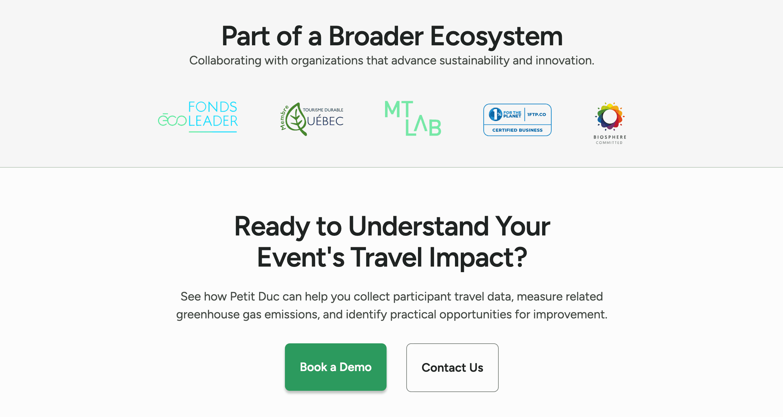
I could have simply refreshed the existing About page with better testimonials. Instead I broke trust content out of that single page and distributed it through the scroll.
I placed trust markers exactly where research showed doubt actually surfaces. More design and IA work, but it matched how people actually evaluate, not how the navigation of the website was originally organized.
03
One clear primary CTA, with a low-commitment option beside it
The existing site used three CTAs with inconsistent labeling, so visitors couldn’t tell which one they were supposed to take. Research showed most visitors weren’t ready to commit to a demo on first visit. They wanted to ask questions first.
I kept two: Book a Demo as the clear visual priority, and Contact Us as a lower-commitment option, using visual hierarchy to do the work.

Working together
Owning the client relationship, not just the deliverable.
I led client relationship management for this engagement in addition to the design work, which meant I was presenting research findings, defending scope changes, and negotiating the trade-offs directly with Petit Duc’s stakeholders.
Inside the team, I split hands-on UX research, IA, and design work with two teammates and took the leadership role on the design system: building it and reviewing teammates’ work against it for quality and consistency.
Outcomes
Because the site hadn’t launched yet, success was defined by what we’d track after release.
Primary business metrics
✔ Demo conversion rate
✔ Demo form completion
Engagement signals
✔ CTA click-through rate
✔ Scroll depth
Evaluation-depth signals
✔ Time on page
✔ Lead quality
In moderated usability testing, every participant independently described the site as clean, professional, and trustworthy, and could explain what Petit Duc did and reach a demo without help.
Testing also surfaced a concrete fix that shipped in the final iteration: participants wanted trust content moved earlier in the journey than the original layout had it.
What I’d do differently
The sample was enough to identify patterns, but not enough to know whether they’d hold at scale. Next time, I’d want a quantitative baseline before the redesign, and a paid usability round with 6 to 8 participants instead of relying on who was available during the sprint.
Key Takeaway
User confidence comes from sequence, not volume. Presenting the right information at the right moment, matched to how people actually evaluate something unfamiliar.
© 2026 · Michael Cowen · Product Designer